


A new brand platform to launch the new TRAIN
That was the task.
We helped TRAIN shape a clearer brand platform and a more connected brand experience, spanning everything from stage naming and brand architecture to logo design, visual identity, website design, wayfinding, and press coverage. The goal was not simply to refresh how TRAIN looked, but to sharpen how it presents itself as a venue, a cultural institution, and a musical force in Aarhus and beyond.
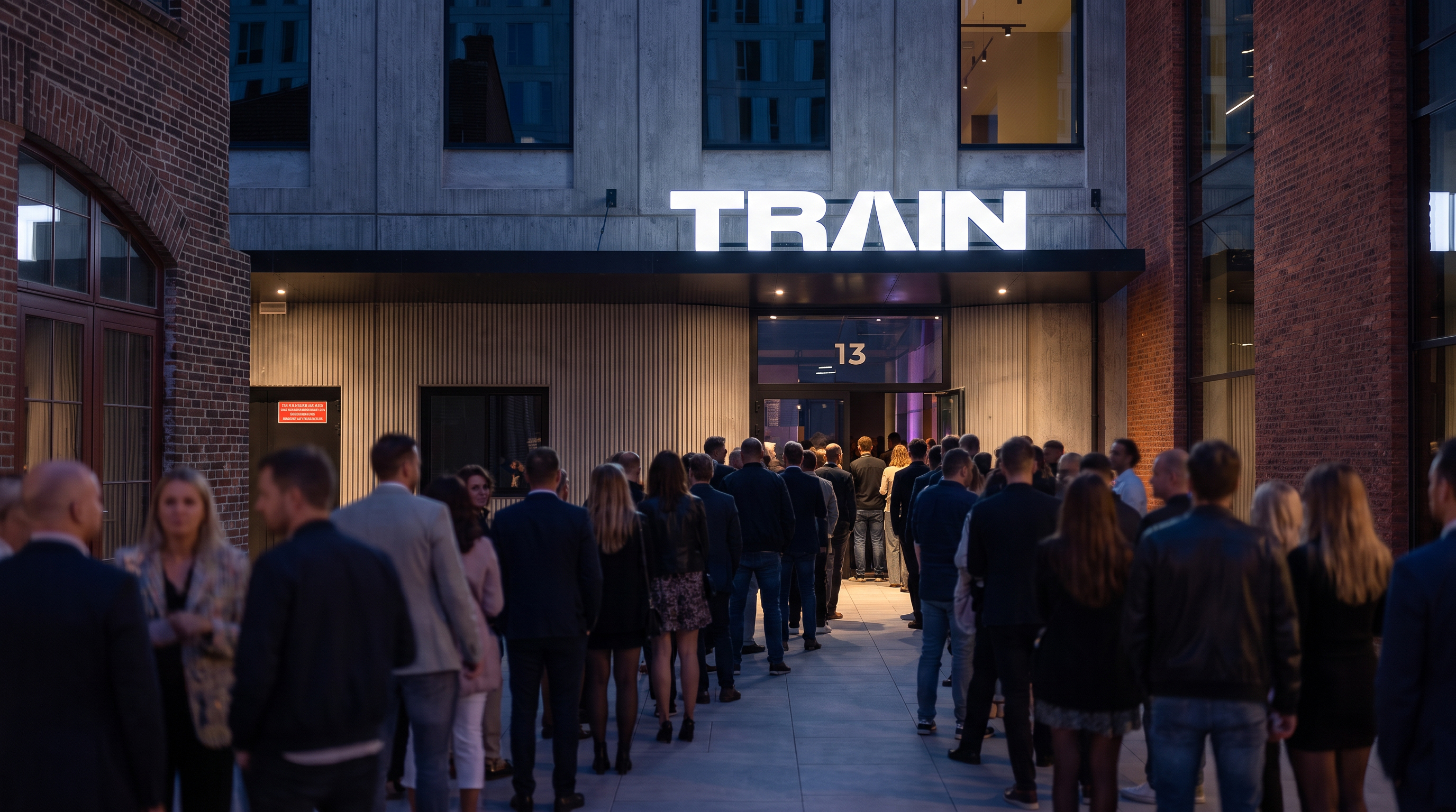
TRAIN
Year
2026-
Deliveries
Brand Platform, Naming, Visual Identity,
Website Design, Wayfinding, Communication,
PR & Press Coverage.
A new chapter for a landmark venue
As TRAIN prepared for its move to Sydhavnen, the venue was also entering a new physical and strategic reality. With the opening of two new stages, one with capacity for 1.500 guests and the other for 350, the challenge was not only to update the brand, but to create a clearer structure for how the venue should be understood and experienced.
Furthermore, the ambitions were bigger than just being another venue. The goal for the new TRAIN is to become a landmark for music. From development of new musical talents to showcasing music from international stars across genres.
We took all these ambitions and boiled them down to a new brand platform and payoff “Where Music Comes Alive” to highlight the ambition of supporting the merging talents and showcasing the biggest stars for engaged audiences in new and state-of-art surroundings.
Built to be recognized, used, and remembered
At the heart of the identity is a symbol rooted in both the name TRAIN and the live experience itself, referencing the railway horizon, the stage spotlight, and the familiar logic of the digital play icon. Together, these elements created a stronger and more cohesive identity, designed to make the venue easier to understand, navigate, and remember.
Turning expansion into identity
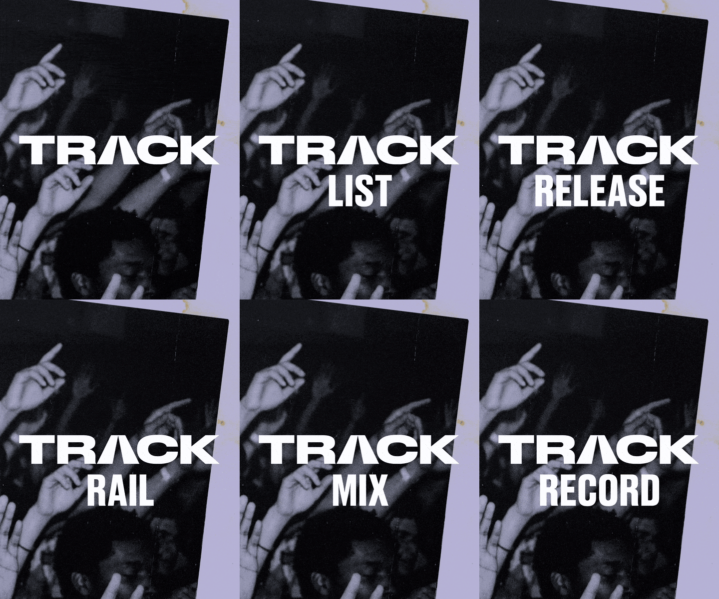
We helped translate that expansion into a coherent brand experience. By defining TRAIN as the main stage and TRACK as the smaller stage, we created a more intuitive and recognisable framework for communication, navigation, and audience experience.
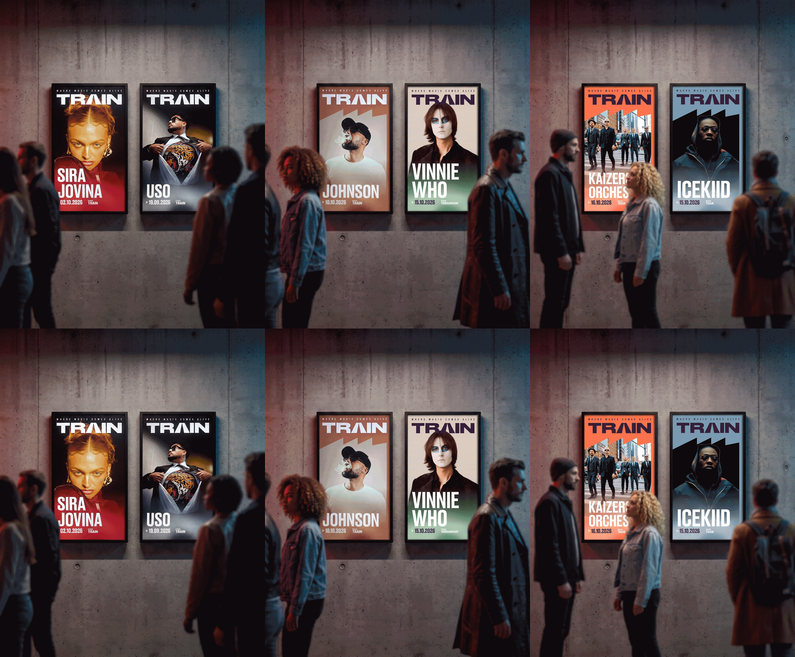
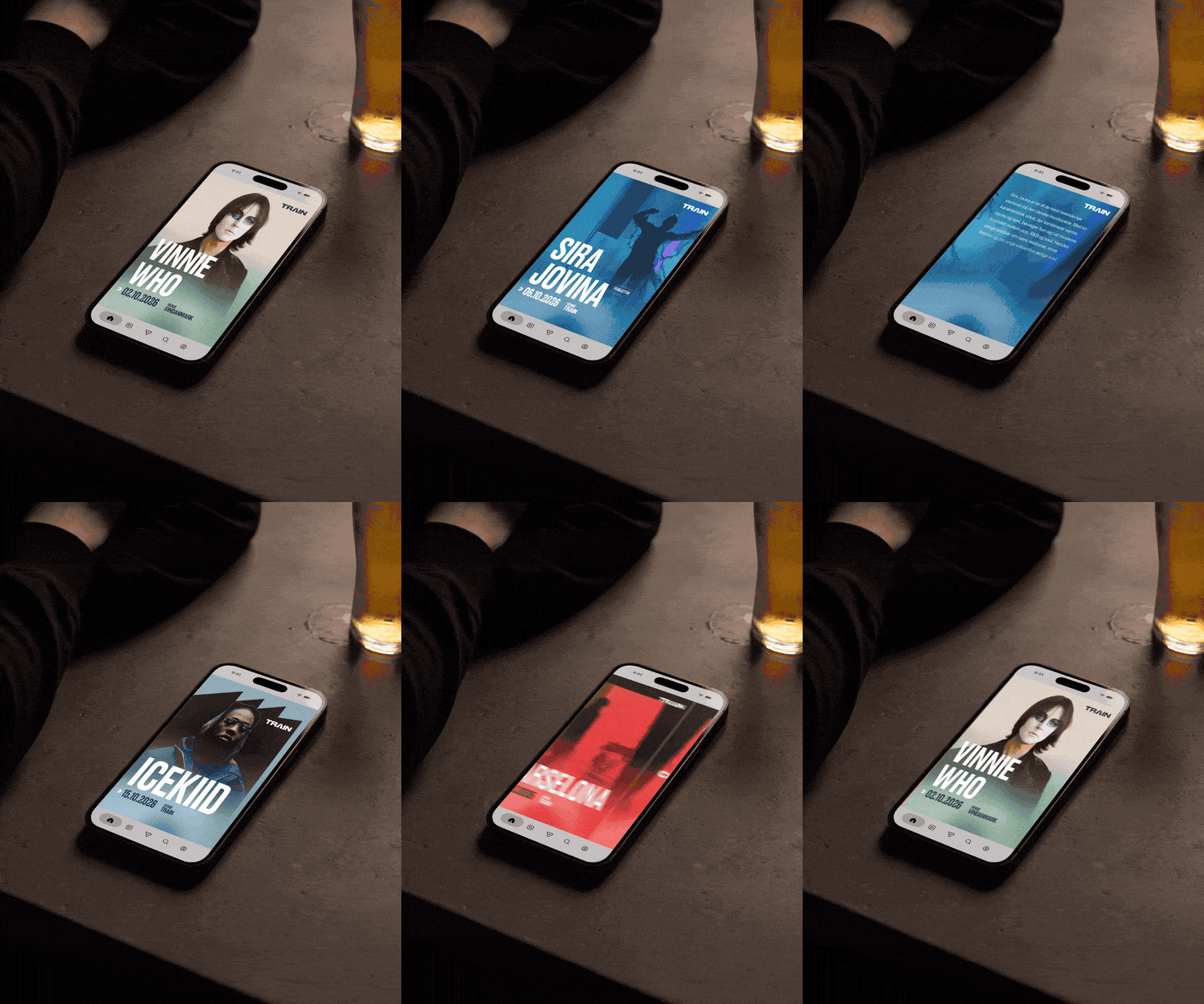
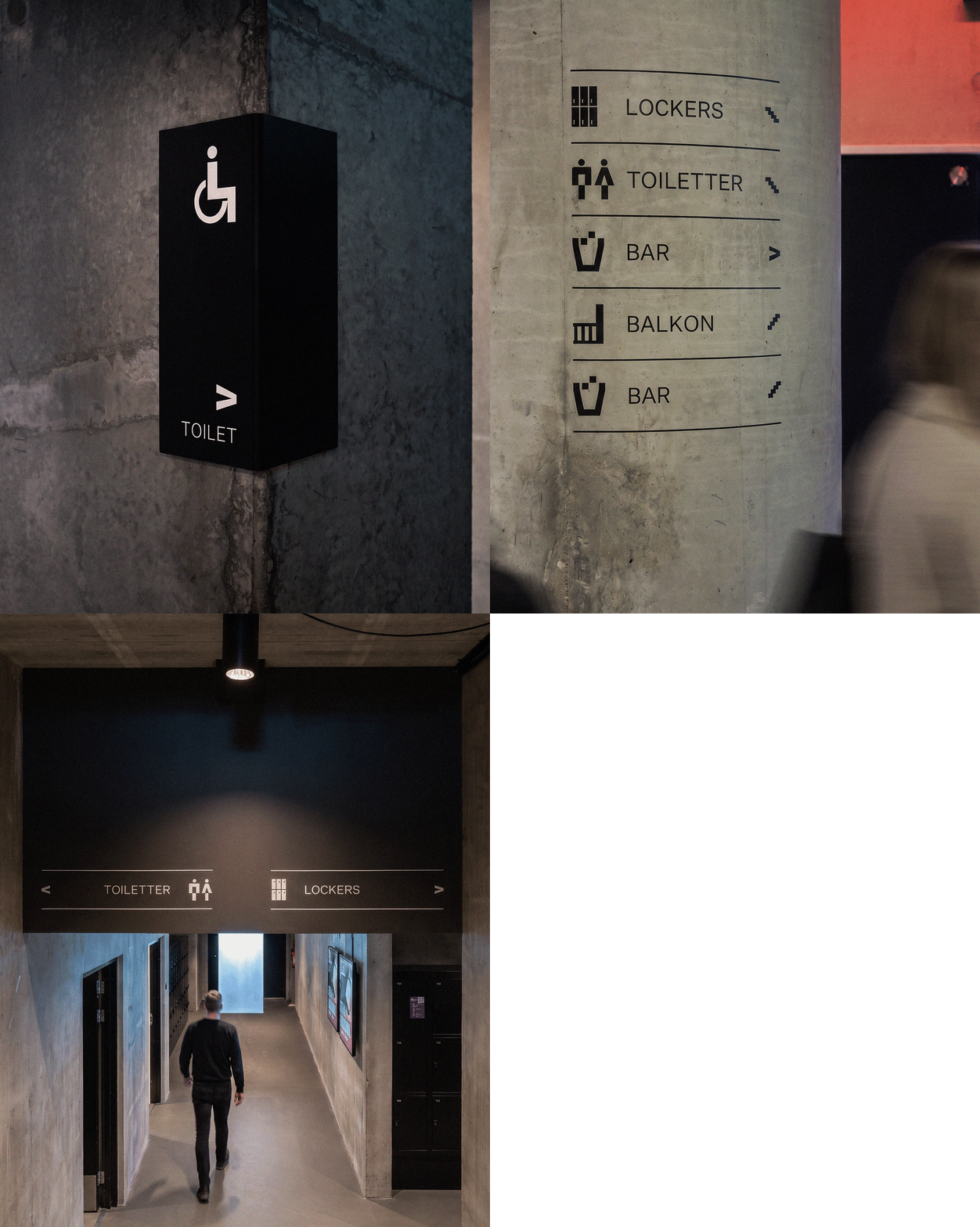
From there, we developed a complete visual identity system for TRAIN’s next chapter, including a new logo, a clear typographic structure, and a flexible graphic language designed to work consistently across wayfinding, posters, website, and social media.
A launch to remember
Good ambitions can only take you so far. “Where Music Comes Alive” is also a promise to the audience, so when Thomas Helmig stepped on to the stage and concluded “Det er et totalt fedt sted det her”, we couldn’t agree more.
The launch also gained national visibility through press coverage across Denmark, including DR Nyhederne, helping position TRAIN’s next chapter well beyond Aarhus.

Get in touch


41, 3. sal
1606 København V
Denmark

8000 Aarhus C
Denmark

GxE is owned by working partners and by First Chair Group, which also holds a majority stake in the consulting company Pluss, among others.
We are a Brand Experience Agency driving growth. Always ahead of increasing complexity. Always behind seamless cohesion.
